User Testing
 A nifty concept that seems like a no brainer. Have regular people test a web site. You'd be surprised how many web design companies don't even bother. They are the professionals right? They know how it works. That nifty little concept is the difference between a visitor picking up the phone to call you, or clicking back in the Google search bar for another business.
User testing can bring to the forefront the mistakes that are not so obvious to the developers, but are obvious to the user.
Example:
While testing Blue Water Hot Deals (a coupon web site) I actually stood behind a user while they were surfing through the site. What we originally did was put a "Get Coupon" button right underneath the actual coupon, so when the user clicks "Get Coupon" it takes them to the 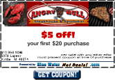 coupon. Well, as I studied the user's movements, she decided to go to one of the coupons. She clicked once, twice, three times... nothing....and then moved her hand around in such a way and clicked again hoping to get better results, but still nothing! She was clicking ON the coupon itself and never even looked at the "Get Coupon" button! We didn't attach a link to the actual coupon. Seemed sooo obvious to me that there's a button there, but hey, I built it right? I immediately put links on all the coupons as well as kept the button for aesthetics.
How would that have gone over if I were to launch the site that way? I don't even want to know.
Simple solution to a potential disaster because we went through the trouble of user testing.... actually it was no trouble at all, but paid great dividends.
"Whether reinventing the wheel or not, is yet another wheel really what you want to end up with? Objective: Articulate purpose and context to gain perspective on the real problems and genuine solutions.
Context is worth 50 I.Q. points. Solving the systemic causes of symptomatic problems is priceless. Objective: Creating a project which identifies and supports the most valuable parts of the solution on the way to deliverables."
John Soellner, Design Crux
Whether they are simple or complex problems, they need to be solved. If they aren't solved, then objectives are not met.
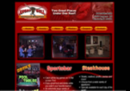 This is a great example of a structured site, even flow with main navigation. Your eyes are automatically looking at the navigation or maybe the picture box,